

We chat to our designer Thaisa Da Silva to hear more about the process of building the SunShipped brand. Originally from Brazil and having spent her formative years in New Zealand, she has just moved to Sydney, Australia.
Tell us a bit about your background…
I’ve been working in the graphic design industry for over 8 years now, and have always been drawn to all aspects of design and arts in general. A little over 2 years ago, I decided to freelance. I mostly focus on branding and website design, and I love spending time developing my own personal digital illustration style. During the pandemic, I was really craving exploring my creativity in ways I hadn’t had time for since design school, which led me to playing and painting on ceramics, fabric, canvas… you name it! I figured I could combine the best of both worlds, and launched my own brand, selling art prints and other lifestyle items on the side as well. You can see some of my work on my Instagram page, and portfolio here.
What drew you to the SunShipped concept?
I really connected with the concept SunShipped is built on – transporting people to a well-curated space of mind and is something I aim to offer and create for my own clients as well. Not to mention, the Antipodean lifestyle is so sought-after for a good reason! Who doesn’t want to daydream and be transported to sunnier and warmer days by the beach?
I think nowadays, a lot of brands and businesses are doing so much of the same, and products can easily become a washed out copy of something else, lacking depth and meaning. So when a brand comes around with a curated product or offering for a specific niche, it will most likely stand out from the crowd because it’s not afraid to make a statement. It says ‘we’re not for everyone, but we don’t want to be’ and that’s the type of brand and people I seek to work with and collaborate.
What did the design process look like?
I always kickstart projects with a discovery call – this allows me to understand the founders and story behind the brand, name, and overall vision they have for their business. Creating a brand’s identity goes far beyond just designing a logo – I see it as creating a universe where the brand is the main character. Everything from textures, memories, music and places, can come into place when creating the starting point for a brand to be built from.
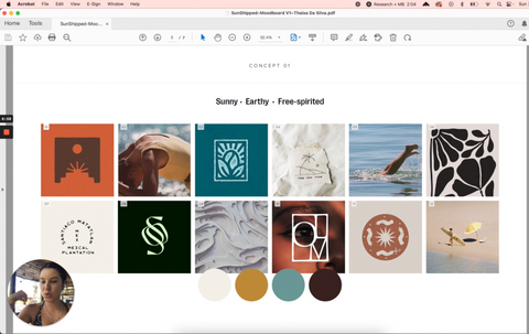
Once I had a clearer idea of the brand and future plans, I started with market research and moodboards – one of my favourite steps. Here, I start pulling together one or two directions where the brand could go. This is usually a fairly intuitive process for me, as I’m big on how brands should feel and what emotions we’d like to evoke in people and future customers when they interact with any touch point.
Based on keywords and themes that came up on the initial brief and discovery call, I worked on two different concepts and approaches we could take the brand to. Aside from the usual references and inspiration for graphics, logos, and typefaces, I also like to add in references for a possible colour scheme, photography and even texture that we could eventually see be a part of the brand – again, a solid and well thought-out brand is always much more than a logo and a combination of colours.
The moodboard stage can be often overlooked or rushed, but it is crucial in the designing and development of a brand, as it acts as the blueprint for not only for the designer, but for the clients also. As a brand designer, it is my responsibility to make the design journey as clear, intentional, and collaborative as possible. From my experience, the moodboard and concept presentation is the moment a client’s eyes start to really sparkle with the vision of what their future brand will come to be.
Because of our time difference and busy schedules, a video call wasn’t possible for this stage, so I presented the moodboard directions via Loom – which helps me deliver my message and proposed directions in a fun, personal way. I find it really valuable to explain why I include each image, and how it will be used as a future reference – with specific details of how and where it could be applied across the brand. Every step of my process is intentional and purposeful, and the same goes for the work I aim to craft. Creating layers, details and nuances are what make a brand and a collaboration feel dynamic, full of character and one of a kind.
We ended up pulling references and inspiration from both proposed directions, to create what has now become SunShipped’s unique brand identity. I focused on creating a brand that would feel sunny, elevated, and free-spirited – meaning, it should look airy, flowy, and without unnecessary noise or fluff.
Thanks to the detailed moodboard phase, we had already established we’d be interested in exploring the possibility of having some custom typography. To achieve that, I started off finding a typeface with a good starting point and interesting character, and then manually manipulated some letters, like drawing a new crossbar on the H, removing some aspects and introducing new forms, like the sphere on E (a motif we see across the brand, as a reference to the sun – one of the brand’s main characters) and adding in the wave, connecting the H and P.
As for the brand icon, we knew from the beginning that it would include a direct connection to the sun. The challenge that came with this, was finding new ways to highlight and bring attention to an icon that’s been so thoroughly explored and used across brands and graphics since the beginning of time – literally. I had to take into consideration the applications of this across the brand also – as it will be used across print and digital, in large and small format. After lots of experimentation I came up with the concept of placing it inside the oval/circular graphic element – and not only does it add emphasis to the sun, but it also creates a layer of heritage and depth that the brand needed. It carries meaning, and serves as a token that reminds you of places you’re yet to visit, like a stamp on a postcard, or a pendant on a necklace from that trip you took many summers ago.
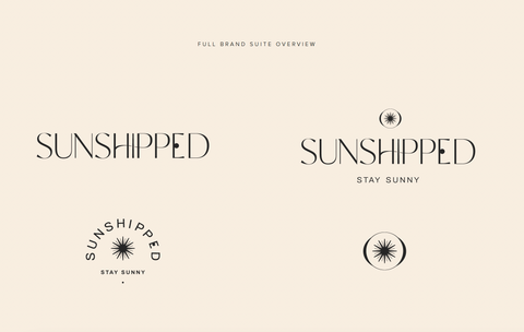
Once the primary and secondary logos and icons were designed, the rest of the brand sort of fell into place, it was a fairly intuitive process. This was possible because we had spent a lot of time going through questionnaires, the thorough moodboard process, and of course clear communication. I explored the idea of a sunset for the brand mark – with the sun in the centre, arched and horizontal typography. For the colours, I was inspired by everything you may see on a full day at the beach, from midday into sunset, and that also led me to name all the colours in the same way. The primary colours are named Sol, Salt and Terracotta, and other brand colour names include Sand, Pebble, and Rosé.
One of our values is ‘Sunny’, how do you find brightness in everyday life?
To start with, I’m a big believer in curating your surroundings. Whether it’s my home or office, having a space that feels like a true reflection of myself has a huge impact on how I feel. That’s actually one of the reasons I started my brand, Thaisa Designs, last year.
I’ve learnt to prioritise my health: in the physical, mental, and creative sense of the word. I try to start my day taking things slow, and do a workout or a good stretch session. If I can’t make time for it in the mornings, I also enjoy breaking up the day for a walk in a new route, and grab myself a coffee or juice – it’s also a great way to explore the new city I’m living in. In this day and age, we all know how much moving your body has to do with how you feel. But I’ve also learnt that I have to actively make time for my creative hobbies – sometimes it’s working with ceramics, other times it’s developing my illustration and painting skills, and lately I’ve been really into sketching and drawing with oil pastels. I’m currently making an effort to doodle everyday for at least 30 days, and even if I only have time for as little as 10 min, I still take the benefits of that into my routine, and I then find it easier to bring that playfulness and curiosity into my work.
I also love doing my own nails – it makes me feel so much better and happier! I love trying new designs and I even like to train my arts and crafts abilities and try a bit of nail art when I’m feeling adventurous. It’s a habit I picked up when I was a teen, and I think I’m quite good at it! I find it quite relaxing and it genuinely makes my days feel brighter.
What’s your ultimate sunny holiday destination?
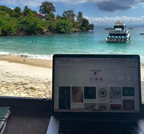
Hard to narrow it down to one, so I’d have to go with two: the beautiful island of Bali, and Brazil, of course! But I’ve also recently moved to Sydney, where it feels like it’s always sunny, and I can easily walk down to the beach, go on a coastal walk and feel like I’m on holiday. Honestly, I can't complain!
What are the top three items you’d pack for a sunny holiday?
Multiple pairs of bikinis – obviously – and I love wearing bikini tops as crop tops also, with cute shorts and an oversized unbuttoned linen or cotton shirt for a quick cute outfit. Followed by a good pair of sunnies, and comfy sandals. My go-to’s would have to be Havaianas and Birkenstocks.